Monthly Archives: November 2016

Project -Observing the Human Figure Part 3.1

Exercise -Drawing the human figure, Linear and tonal study.

 • Set model up in comfortable and relaxed pose with light. 

 • For line drawings the light is fine being natural but for tonal; use directional light.

 • Look to the shapes surrounding the figure that will help to ground the figure- the Gestalt principal of ground and figure is good to remember.

 • Make several sketches , working quickly and making sure your measurements are good.

 • Allow your model to rest.

charcoal drawings A2 size on paper

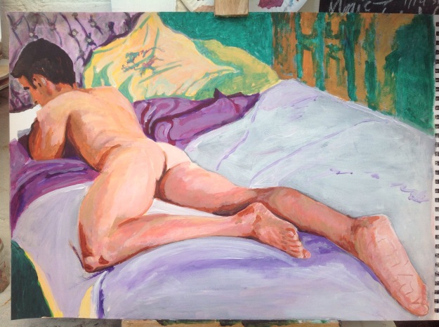
First of all I wanted to paint from my drawings as the model was not able to stay for to long. When I attend Life drawing classes, they range from 2 hours to 6 with many tea breaks. This pose I was able to get my husband to do and was able to spend longer drawing him until he got cold. The room where I pay for a model ;unfortunately they won’t let you paint as past students have not cleaned up and none of us are trusted any more. For this reason I decided to paint my husband.

Indian ink and Pastel on card

The linear drawing was an Indian ink with a calligraphy pen and brush and masking fluid. I wanted to keep some definite tones white. The drawing at first became dark in tone and need to lighten the tonal variation so added the pastel and then decided I would blend in some colour, basically the drawing evolved after the model had finished.

Look at this link from Tate–Henry Moore- Shelters in the tube.  This was a style that influence me with the linear study and the doomsday colour combination.. Under the pastel is lots of pen details which have been clouded over.

I will try to complete some more painting/ drawings in 30 minute sessions and not focus on the background as much. I feel the ink lines still dominates even though I have added to it with PASTEL, it is still noticeable and adds depth to the medium. The scratching of the calligraphy  pen nib and the flicking of ink is a technique of not getting to caught up with detail as with one flick of the pen and a big blob of ink can dispense anywhere. I enjoy this spontaneous fluid and pen but find I can over do the detail and overall the image becomes to dark as not enough variation of tone.

img_2218

Acrylic on card

The tonal figure study, mirrors the first pose and this helps with my confidence if I repeat the images just in different mediums, it allows me to think about what the medium is doing and the colour relationships and less of the figure. I worked with natural light and feel the darkness of the head and the lightness of the foot are good variations of tone. Some shadows from using directional light, could have added drama, but I wanted an essence of; privately viewed and natural setting with the nude. The life drawing classes that I attend are so staged and tutorial based therefore look unnatural.

The foreshortening was something I wanted to capture as I find these poses intriguing as the mind works to decipher if the limbs are correctly measured. The tension between what is seen and what is imagined are ways of vibrating the image and then to use colour contrasting as a complementary colours scheme to depict tonal variation allows more vibrations. I feel the painting looks contemporary mashed with the style of modernity .

Alex Katz is branded as a pop artist but he started before and kept going long after the movement. His work has strong definition of tone variation and hardly any mid tone, very flat with many layers of paint to archive that blend of colour. His work is more stylised than branded like pop and I perceive his work as intimate figure painting .

Henri Matisse https://g.co/kgs/t6eyyQ colour construction as seen in -Portrait of Madame Matisse (Green Stripe) is an eclectic system and style. His development of the shapes with the medium of collage suggest his intent relationship with the exploration of the figure. The green and orange background I painted is used to show the colour system of contemporary colours that I choose as my colour pallet and I painted the layers so the complement colour could be seen in areas.

The mix of styles; old and not so old (1869-1954; Matisse and 1927- 89 years old; Katz) complement each other and I feel they vibrate together well. I don’t like the use of acrylic but this medium did help to blend the flesh tones without getting to thick with paint as I used card to paint on.

Have I created a solid form existing in space?

The pose of laying on the bed adds weight to the figure. The Gestalt principal of perception of ground and figure relate in this composition as the figures weight , especially around the left knee and left elbow indicate a sinking into the covers of the bed. The folds of the sheets indicate that the figure is laying on-top of the sheets. The lines of the bed are foreshortened and the angle exaggerated so delivered a view of perspective. I feel this painting shows solid form in an existing space as the figure is engulfed in the surrounding sheets which show pressure of weight from the figure and the use of foreshortening gives a dimensional illusion.

References-

Henry Moore institute

Alex Katz

Henri Matisse

Gestalt Principals

Mirror Phase.


Grayson Perry- the vanity of small differences.

Beaney in Canterbury , October till December 2016
This is a small exhibition and realy wanted to buy his sketchbook but was £40, I was interested in how he connects all his ideas together and how he make decisions on what to narrate.

I understand he reflects to the past Renaissance religious paintings for guidance with compositions and modern day delemars for topical exploration.

These tapestry are inspired by the 18th century painter William hogarths moral tale  –

When Hogarth embarked on his second Progress in 1733, ‘the rake’ was a long established symbol of masculine waywardness and depravity. An inveterate consumer and ‘man of leisure’, the rake of convention fritters his fortune, usually inherited, on sex, drink and gambling. Along the way he amasses huge debts and seduces, impregnates and abandons at least one young woman. As with the prostitute, a literary convention had developed in which the rake starts life as an impressionable young man from the country who comes to the city after inheriting money and swiftly embarks on a dissolute life. His fate typically involved venereal disease, debtor’s prison and death. http://www.tate.org.uk/whats-on/tate-britain/exhibition/hogarth/hogarth-hogarths-modern-moral-series/hogarth-hogarths-0

Grayson Perry tapestries are centered on the dramatic fictional life of Tim Rakewell. He develops his life from a lower class beginning into a wealthy man who sells his company within the modern world and then his untimely death in a bloody car accident. https://www.theguardian.com/culture/charlottehigginsblog/2012/jun/06/hogarth-grayson-perry-tapestries

The people he has interpreted within the work are from Essex, this gives an eccentricity and British glam depiction. They are peculiar, just like Perry; a plethora of rich life being celebrated and hung majestically as a bright colourful tapestry.

I am currently weaving a rug on a hand weaver. It has taken a year so far and I have created a meter long runner with another meter to go. I wish I had Perry’s machine that weaves his massive works. But it’s not just about the technique it’s the ideas behind the work, the compositions, the art work becoming theatrically scripted scene by scene.

In the Artical linked above from the Guardian, he comments on taste and  where it originates from. Weltlanschauung is German for World perception ; a particular philosophy or view of life; the world view of an individual or group. The perception of what is good and poor taste is just a perception, a mater of opinion by the spectator. Pierre Bourdieu (1930-2002) work called ‘the social definition of photography ‘asks questions about etiquette and rules of perception ; what our expectations are- barbarous and ignorant or cultured. I don’t feel a need to express myself in defining my taste as its a personal fundamental opinion that has transcended and hugely connect to my ideology. I like to reference work that I call my favourites, these are works that connects with me, for some reason that I like to give attention to within the conformity of this learning blog.

Georgia Meodows- Stitched drawings

Georgia Meodows has worked as a occupational therapist and helped elderly people for a long period of time. The exhibition asks the spectator to think about what they are giving meaning to, with questions such as ;are they hugging or holding each other up and she doesn’t smile because she has no more teeth and her jawline now is dropping but she is very happy to see her family. These drawings on the soft fabric with the medium of soft thread softens the harsh reality of the problem we all face – old age.  My favourite was the two pillow cases , one was of an elderly lady who is within the care of an Instutions (such as a home) and one is of an elderly man who looks after himself , with the help of his family. She is clean and healthy but feels sad, isolated and neglected by her family. He has bed sores and is smelly but is happy when his family visits. This exhibition questions moral views and what we see isn’t alway what is moralistlcaly correct.  I came away from this exhibition thinking -We should interact more, even if it’s just a smile.

I think the media and the technique where the artist has used very precise detail with little detail and the connection with the padding connects a need to interact with these works, I could feel a need to reach out and felt the padded cloth.

This exhibition is Accompanying the Grayson Perry exhibition at the Beaney in Canterbury from 24 September till the 27th Novemebr 2016. I can see the relationship between the two artist. When Grayson Perry showed his ceramics at the turner contempoary in Margate in 2015, I was excited by the use of a craft medium such as ceramic vases to send a message to the fine art world. Not everything has to be about paintings , films and installations for it to be considered an exhibition. Using fundamental objects and mediums can be just as powerfull such as fabric, thread and ceramic. It is reminiscent of home wears, things that we decorate our home with so they are considered safe , soft and cosy – decorative. But for Meodows and Perry they are exploiting the decorative sense as a medium of signifying modern day delemars.

Assignment 2

Your painting should demonstrate understanding of colour, tone, composition and the development of your technique in your chosen medium.

I have gone for the alternative option which was to develop further one of the exercises that I worked on in part 2. I worked on a square canvas as I feel this connected with my composition ; a room within my house.

PAY PARTICULAR ATTENTION TO –

  • viewpoint
  • light source
  • highlights lowlights
  • relationship between background and objects
  • mood

img_2186img_2188

I wanted a composition that was going to show depth and throw some interesting shadows onto forms and show more than just furniture but an essence of a room in my house. I made changes to the photography (to monochrome) , a technique to able me to pay attention to the highlights and lowlights within the room. The tone variation and the light coming in from the window become glow like. This way of analysing the depth of tone helps with reviewing darkest and lightest areas and then I build up the tone between the two.

img_2189img_2190

Have blocked in the main shapes and have measured the furniture against each other . All the furniture is crammed but this is helpful when connecting the shapes and forms as they all link or connect in some way. The relationship between objects and background are very closely connected within this busy composition.

I was starting to think about colour at this point and researched some work by David Hockney, Hopper, Richard Diebenkorn and John Bratby.

On The second day of painting I should have put some tape on the floor to mark my Donkeys location as I moved my position and  this effected my viewing point and the shapes did not connect correctly any-more so I had to make changes to the view point- linear perspective , vanishing point. I also felt the light was very intensified on the monotone photo but not as noticeable during a day of painting which was overcast. This is when the photo taken can be helpful in seeing beyond what’s in-front of me at the time.

I had to take stock and reflect upon what I was signifying and what I was spectating at . I wondered; as my style is normal wonky, should I look to Grayson Perry for inspiration as his compositions are lively, modern and colourful , but the brief in the exercises in part two suggest to be as true to actual perspective as possible, so I measured up my painting again and made changes to the placement of furniture and reduced the size of the paintings on the wall and started on colour.

img_2191

img_2200

Chests, Hove, 1975 (no 23) by John Bratby

At the moment the desk in the corner is too large and is in-line with the corner of the room but this piece of furniture is set away from the wall so the two lines shouldn’t be inline with each other. The fire place looks as if it is leaning against the wall so the angle is to serve and the pictures are hard to work out if I’m looking at them or up at them and what should their shadow be doing. I turn on a light near the window to help me on another overcast day. Did more studies of the lines and tones within the room again to help me focus and concentrate on the structure of the composition as the colours have become distracting. Having trouble with Rosie the dog so did some quick charcoal drawings while sitting on the floor.

img_2193img_2201img_2202img_2203

Very much like the violet wall; taken inspiration from John Bratby -Chests , Hove, no 23. John Bratby Portraits, National portrait galley publication. London 1991

The split complementary colours of red violet, green and yellow are  cool but directing towards warmth at the same time. The light coming in the window is now more ghostly  and less of a glow. The violet wall is starting to look like it is on fire so need to tone that down as far to prominent.

img_2195img_2196

I was able to put some glow back into the window although it would have been better it it was a more radiant glow but instead it is a muted tone glow. Very pleased with the shadows the arm chair gives on the rug and up onto the desk, I feel this is reminiscent of HOPPER. Love the rug and the colours and this association of Richard Diebenkorn reminds me of my youth ,as I studied his work at art school. The blanket, on the leather chair with the Broken arm reinforces the Diebenkorn rug and was tempted to paint this in more but I have come to a stage where I am close to a finish and need to be careful not to lose the essence. This is a cramped basement because we have adopted the lounge upstairs into another bedroom so foreign students can stay in which gives us A little more income. This room is very cosy but is over crowded now.

Rosie the dog is being a problem where she knows when I am drawing or painter her so turns her back to me. I have drawn some studies of her to help when painting her in but may have to take her out of the painting or paint the blanket grey so she is more defined. I wanted her in as she is a big part of the room and she gives the room life, it becomes more than a room full of furniture but a room where Rosie lays.


img_2199img_2205

  • Need to get this posted to my tutor now but- I don’t like the cushion on the leather chair as it’s far to white and resembles snow drops. Will need to think about this area again. Want to take out the picture on the top right corner. Other than that I am happy for now. Will await tutors comments.

EXERCISE- Simple perspective in interior space.

Create and illusion of space. Take note of the vanishing point and try to work with a degree of accuracy.

  1. Is the perspective believable?
  2. Does it look wrong anywhere?
  3. Why do you think that?

First Exercise was to draw some quick sketchers around the house. I worked in charcoal and pencil then moved onto washes in the exercise- drawing with paint.

I like looking at views of familiar surroundings. I sat to view these drawings and the ones that have a lot of natural light are the most successful, my favourite is of the stairs in the hallway as the contrast between light and dark is intense. Not on show here.

In the end I choose the view of the downstairs fireplace. The low ceiling and window attracted a squashed level of light and the busy interior shows the stillness and crammed interior . There is a sense of something here that I can explore further, maybe within  assignment 2.


Colour pencil was used to check colour balance and then I discovered by drawing in paint that I should paint this composition on a coloured ground- a mid grey so to tone down the value of colour.

When I painted the wash on coloured paper, I wanted to try to create perspective so angled the composition to exaggerate this illusion. This use of changing the vanishing points location reminded me of the recent GRAYSON Perry exhibition (- The vanity of small differences) that I visited in Canterbury. His amazing tapestries are very colourful , narrative and lively,  The wonky perspective creates the illusion of narrative.

I splattered some paint into the corner of the room to add tonal interest.

I used to much white paint to create light from the window. I find that the white wash on coloured ground is difficult to see the full extent of the intensity when wet.

The leather chair was not proportioned correctly, so I had to draw over the wash and now the overall perspective is seen from a standing position.

The use of the rug to add dimension to the floor which works well.

Finally I wanted to add some life into the composition as from my research on the Dutch painting genre made me aware of the need for people within interiors  to give a sense of emotion. I took a photo and thought the man and the dog were not to prominent, But give a certain present to the rooms purpose.

The glow of the light from the over hanging fitting, reflected a curve like shadow onto the ceiling and when I painting this in a wash and Indian ink with a calligraphy pen , the feel was a cave .  I like this look as this room is subterranean and can feel like living in a basement which is cave like. I have used part of the photo as a technique to check my linear perspective and is useful to check the colour tone.