Category Archives: Assignments

Tutor report reflection. P5. L1. pop

Another highly influential video tutorial with Diana Ali, She is the most efficient, effective and self driven person I know. 
The outcome of the report was;

 • New confidence in handling paint and interpreting my surroundings.

 • Worked with technical aspects to my advantage.

 • Showing an openness to new ideas and new mediums.

 Things to resolve before assessment;

 • The straw in Assignment 4/5 (1st attempt) needs to be attached in a different way to the board. It needs to be embedded with the composition.

 • Consider renaming your work, when you spell something out such as ‘Microbiology study’ the viewer becomes less engaged.

 • Need more studies to show creative thinking behind the exercises.

 • Keep questioning your own work and the work of others, If you don’t have the answers, that’s OK as it shows thinking about possibilities.

 • When being self critical, think about how that will move you forward, don’t be so negative in your blog (pessimistic).

 • Make blog images bigger and add in background images so it’s bright and colourful like myself.

 • Foe assessment; Lay out all work, pick out pieces that show a variety of techniques and breadth of skills.
Areas to reflect upon;

 • Assignment work 1-4 still quite flat with tonal qualities and light. Have focused more on the development of semi abstraction and techniques of working with other mater.

 • Assignment 2-3 are verging on being too easy to abstract and not connecting with the rest of the series. The balance of progression within a series of works, needs to consider the elements.

 • Assignment 5, final image has resolved the above concerns with layers of colours, texture, focal point and the size helps to balance the progression and give the work purpose. This envelopes an understanding of paint and gives a sense of a scene.

 • Writing is in-depth and a journey of progression has been documented well, self reflective throughout.
Suggestions;

Alberto Burri- Artist that burns plastics

Yinka Shonibare- Textile artist.
My Thoughts

Really pleased I have been able to move away from pictorial representation but still able to convey a sense of place. I would like to build on the works I have created over the past 16 months with this new confidence. I am much more aware of what is required from me as a student and I must remeber to question certain directions so to gain more breadth of possibilities. Moving forward I would like to set up a Web site and Facebook page so to become more connected online, not just with other students but with a wider audience. I would like to exhibit some work but I don’t have enough commercial pieces yet so it would have to be a collaborative show. This stage of my art education and past retail management skills are sliding together like tectonic plates, I normally try to keep the two areas apart because I become overly influenced by the audience. 

Evaluation of Assignment 5 works

Write an evaluation of your series of paintings and of the progress that you feel you have made as a painter. Draw attention to the parts of the course that have furnished you with the most creative resources and explain why this is.

Notes-

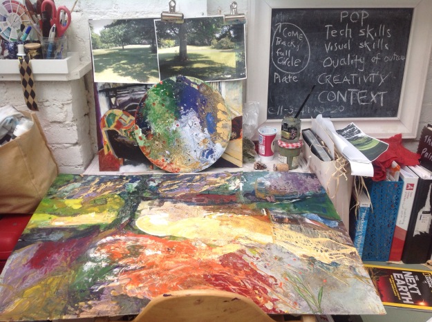
My series of paintings are of a development of a landscape which was first painted for assignment 4. The development of this landscape is how it becomes progressively more abstract. My first initial plan, was not how the work progressed; I first planed to take one  composition and focus on areas of that composition with dedicated supports. For example, the park bench that is covered in moss , graffiti and expresses intricate textures was going to have a support suggesting these textural features. What I did do was take my Tutors advice; “…think about a sense of self-discovery to investigate what paint can do.” This Part of the course ‘ The practice of painting’ is called; Personal development and I certainly feel that I have developed along side my Painting Practice. The series of works that have been sent to my tutor are nothing like what I initially planed, these works have progressed with referring to my tutors comments above and researching the Objective Abstraction group. I did work with the paint and a surface, but the plan of depicting certain subjects was deconstructed with the use of paint handling techniques. Removing myself away from the paint brush was revolutionary as exercised in the project ‘ Different ways of applying paint’. The other key factor was the project; ‘working towards abstraction’ because this delivered me to the National Geographic magazines, where most photographs are taken from a satellite  position therefore they describe an abstract world.

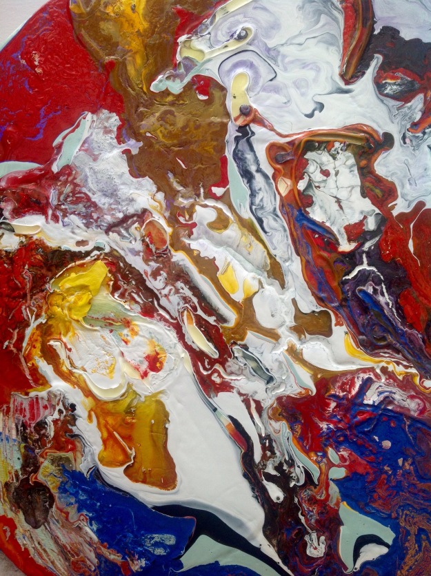
The National Geographic magazines are a fantastic resource for me as the paper quality is so glossy that when you wipe it with cleaning products it has the same qualities as paint brush work. Why was this important to the creative process? The connection is the glossy photographic modern machine made medium placed within the same context of my creative space. This resonates with me, as the actual wiping away modernity and then placing that deconstruction within the context of my expression. I have taken the magazine pages, stuck them where I wanted to as a means to express a sense of a landscape. I then cleaned the glossy ink away where I wanted to blur the images and then I dropped paint down onto the same surface and watched it spread out, infiltrating the areas of collage. I interfered with the spontaneous paint spreading by moving the surface, I also removed and carved into the paint by scrapping it with a comb or a pine-cone taken from the actual landscape. Finally I borrowed from the artists I had researched through out this part of the course; Anselm Kiefer (1945-) , Sam Francis (1923-1994) and Frank Stella(1936-) I have already noted why and how these artist have influenced my direction of work in this past blog; Assignment 5 work in progress 

I don’t feel this creative progress has come to an end, I am still experimenting with other works that I have not sent to my tutor. I have been recently burning holes in past painted canvases which is something I talked about doing after I received a disappointing result on another course here;Assignment 5; Final painting.. I found the marks left behind on the canvas was an image of danger and was fascinated how the paint shrivelled up in the heat. The holes that were left by the fire needed treatment, so I attached a magazine page taken from the resourceful ‘National geographic’ and stitched over it. My technique has become progressive, just like my painting practice, finally the two have made a connection.

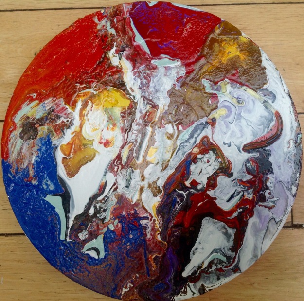
Collage, Enamel paint, burnt canvas and embroidery thread. (some of the enamel paint has been pealed off from the drip tray and then the reversed side has been stuck onto the canvas- top left hand corner and orange sauce mark in middle)

Enamel paint on fabric with embroidery hoop then stuffed. (PS. The hoop is not framing the painting but finishing the painting, adding the final touches as the Embroidery hoop is not the frame , it is an element of the painting. The circular, puffed out fabric suggests the painting as subject)


img_2531

img_2532

Enamel paint with Aliphatic Resin

img_2515

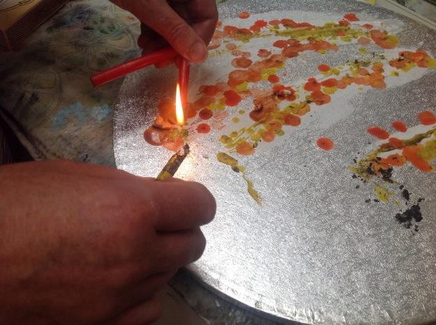
Melting wax crayons with taper onto cake stand that’s had filler applied.

Evaluation-

Demonstration of Technical and visual skills-

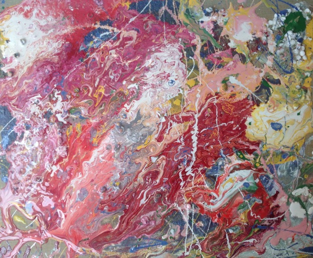
I worked larger and with more fluidity suggesting a gestural semi Abstract illusion which demonstrates ownership of the medium ( Enamel paint), texture, and colours which are used to explain depth of perception. The layered colours suggest a sense of place under the tree; a focal point and area of engagement.

Quality of outcome-

The progression towards the final painting was a formula of trying out different ways of working with paint (4 studies) and then reflecting on the outcome before preparing to work on another painting. I had to analyse the outcome of the painting process and select what direction to take next each time. My judgement was based upon my contextual research of other artists. By understanding their work I am able to understand my own work, I am now at a stage in my learning process where I can be guided and not over influenced by my research.

Demonstration of creativity-

I have added other matter to paint from assignment 2 onwards and have painted on untraditional surfaces such as carpet and fabrics so I have gained more confidence using this as a technique to add interest to the overall image. I feel this shows invention and independent judgement. I have challenged the ideals of painting being just about paint. Is the ‘creative arts’ more creative than the ‘fine arts’? I am more intrigued with paint and other context/matter than I was at the beginning of the course.  I have taken notice of my tutors comments; to take experimental exercises from my workbook and reference these expressions in the assignment work. My research and breadth of reference have encouraged risks to be taken and I have persevered with this technique as a way to move forward and improve.

Context-

I recently asked some questions on the OCA forum about this particular subject. The responders  were very helpful and some were frustrating because they had misinterpreted the question (on hindsight the critical response was helpful in another area). I had also watched a university website video about critical analysis which correlated well with this subject. The student in the video was explaining how some students think that a critical review should not be to critical, but the student questioned this idea; If the reviewer is engaged enough to give sound critical analysis then this should be heard and responded to.

All interaction is good as long as its helps the person to move forward. I find I struggle with this, hence why I asked for help on the forum; which on its own accord was a process of discovering more. I have a tendency to take comments personally, I am emotional naive. Its  easy to ask certain people advice when you have pre-empt the anticipated positive response. I will mature as a student when I methodicaly put into motion the  process of dissociating my emotions and re-associating myself with the work.

Reference-

Objective Abstraction link, Cited on 20.9.2017 http://www.tate.org.uk/art/art-terms/o/objective-abstraction

Assignment 5 personnel blog posts referred to- https://melindawpainting1.wordpress.com/2017/07/28/assignment-5-final-painting/

Assignment 5 work in progress


Assignment 5; Final painting.

I knew I would find this a difficult painting because the expectations were highly anticipated and I wanted to achieve so much. I wanted to adopt some of the experiments found in my workbook and due to the assignment being large (A1) it took time and space, But it could have been twice the size. I think I may redo it but on two A1 boards.

At the moment I am feeling very deflated by the results I received from my last assessment  (understanding visual culture) so the challenge is to keep the pressure on and get this work sent before I take it all into the garden and burn it! Emotions are running high.

The reason I had high expectations was because the other paintings before were indicating a direction towards expressive abstraction with the help of some technical processors such as flattering the composition by focusing on shapes and not perspectives and working with the medium of paint and not using the paint to resemble a subject or composition. I feel that I could keep adding to this final painting and it would just absorb it without adding value. So I have decided to send it to my Tutor and give myself some space away from it. Again my work has become a fetish, where I seek a materialistic desire for the object which is the changeable and newness that this painting projects to me.

Why Landscape? The context is due to previous work painting in part 4 of this course. The artist that have influenced me are all Landscape artists such as Anselm Kiefer with ‘Song of Wayland’, David Hockney and Thomas Gainsborough with Mr and Mrs Andrews. Although I have no narrative relating to characters, I do have the drama of colour.

Torgesen Murdock’s work found in ‘100 ways to paint seascapes, rivers and lakes’.p. 28 was intriguing to me because;

  • use of colour to create light and drama.
  • Painting of trees in a highly contrast colour range, Colour palette was Cadmium yellow, Yellow Ochre , Burnt Sienna, Phthalo Blue, Cerulean Blue, Viridian, Alizarin Crimson and Mars Black.
  • ‘Shape hunting’ is used to describe the artist design strategy where s/he looks for interesting shapes and how they will place them for full impact.
  • suggests using a ‘mother colour’ to help aid colour harmony through out the overall painting. In this particular painting (Moonlight) the artist used Burnt sienna and Yellow Ochre.

I have been told not to use black by tutors and I have not, but my colour tones do get very dark. I have worked up the texture for this painting using the following;

Collage, pva, shaving foam, sand,  pepper, Grass and thickened acrylic paint.

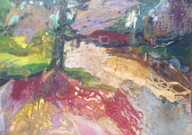
First I laid out the national geographic clippings onto the A1 board and then stuck them on with thick PVA so this would give the sheets a bumpy effect. I then cleaned the clippings with an American cleaning fluid which takes the ink and blends it or washes it completely away depending on pressure and how much fluid I use. I then carried out the paint pot drop technique which is noticeable in my previous paintings. The marbling of the colours were only used in areas of shapes such as the trees and shadows (SHAPE HUNTINGS). I then painted with Oils the areas that were still white. Added more texture, took some away and paint dropped more and then combed in some marks then washed some away. I wanted to create contrast and drama with the use of colour and the use of ‘chance’ created by the drips from the paint pot drops technique. Texture was very important which is why I think I could add more texture but not sure it would add any value. I enjoy the contrast between flat areas and areas of texture. I also enjoy the bold contrasting colours of Naples yellow and white adjacent to the  Viridian tree trunk. I have given this Painting 2 coats of varnish , some is household varnish so has a tarnished tone to it.

Why? The reason I like highly contrasting colours is that it shows light and light is intensity , it helps to explain forms, the time of day and I much prefer light than darkness. Dull paintings or muted tones are still intriguing and dictate mood but I associate these with traditional work and not contemporary works. I wanted my work to become more shiny after reflecting on past work . This shiny effect of the Enamel paints and the varnishing, directs the viewer to see the painting as more manufactured and less hand-painted. Society is attracted to newness and sparkly, glamorous things as its part of our conditioned capitalist ideology. To put this theory into context I would accommodate the affection towards shiny surfaces like the attraction given to newly released films; I and most popular cultures would prefer to watch Wonder-woman 2017 than my childhood favourite of 1975; TV series Wonder-women starring Lynde Carter .So to conclude, Light and Contrast = Intensity, Drama and a clear definition between light and dark zones. It is not about being associated with grey areas, confusion or dull. I feel its associated with clinging onto youthfulness but is earnest and serious.

Some questions I need to think about for my next post; evaluating my series of paintings, referring to the following Assessment criteria;

  • Development of visual and technical skills, design and composition.
  • Competent realisation of ideas , presented well and showing judgement.
  • Development of Analytical and creativity thinking. Showing independent judgements and presenting some indication of develop a personal voice.
  • Awareness of a breadth of contexts and debates supporting your growing personal and professional knowledge and understanding.
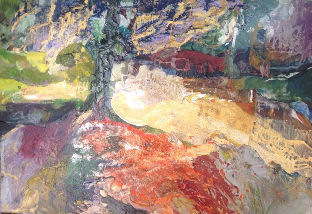
img_2524

Final Painting

img_2518

work area with images and pine cones from the park
img_2513

work in progress

References

100 ways to paint seascapes, Rivers and Lakes . Volume 1 International artist publishing Nevada. USA. 2004.

Oxford English Dictionary. Oxford 2005.

The Art Book by Phaidon Press Limited . London 1994.

Imbd link accessed on the 8th of August 2017;

IMDb: Wonder Woman (1 June 2017 (UK))

Before she was Wonder Woman, she was Diana, princess of the Amazons, trained warrior. When a pilot crashes and tells of conflict in the outside world, she leaves home to fight a war, discovering her full powers and true destiny.

http://www.imdb.com/title/tt0451279/?ref_=ext_shr_eml_tt (2017 FILM)

http://www.imdb.com/title/tt0074074/?ref_=nv_sr_4 (1975-79 TV series)


Assignment 5 update

To be honest, I have got Lost in my work. I have been working with how different colours and types of enamel paint (work together or not work together) flow together, how fast they move along different surfaces and the quantity of paint needed to get a formation of paint that is dripable. The process has been very technical and absorbing, I have had to work in depth with a new medium in a dense space of time. Luckily the paint can dry much faster than Oil paint. This has caused variations in perception as the paint tends to crack if not enough oil mixed or to much oil . This cracked surface is interesting in itself so trying to recreate this again has been difficult. The variables and uncontrollably associated with using Enamel paint enforce a culture of accepting the inevitable, tolerating the accidents or as Pollock (1912-1956) said in his interview with William Wright in 1950.” …with experience-it seems to be possible to control the flow of the paint, to a great extent, and I don’t use – I don’t use the accident- cause I deny the accident.” Harrison and Wood. pg 585.

“Technique is just a means of arriving at a statement”POLLOCK p.586

The statement that I am making with this new found technique is of ‘letting go’ and ‘being free’ to work with the paint. In my earlier work I can see my battles with ;being restricted to paint a representation of nature, my environment as a subject and  following the classical tradition of obligation to the standards of painting. My statement is not about expressing my feelings in the form of Enamel Paint. I used my experience of the familiar surroundings of the Park to decided on what colours to pour onto the canvas as a way of transcribing the composition of the park. My technique is deconstructing previous paintings ( the more traditional compositions) of the park to simplified shapes of trees, lumps of park land and distant perspectives. I then decided what colours to add together and how much paint to use of each colour before poring it onto the canvas. Then I would wait to see the paints marble around each other and decide to move the canvas so to affect the marbling of the paint to allow more patterns to appear or start moving it directly with a cotton wool bud stick and dragging the paint to where I wanted it to go.

Before I worked on a canvas I did tester panel’s, These have been a fantastic resource and I return to them frequently when mixing the enamel paints. These panels also have other things stuck to the surface to analysis the reaction the paint has with textured grounds.

I had spent a few weeks mixing paint and experimenting with different grounds such as shaving foam, Grass, pva and sand, but felt I needed to focus on the completion of the immediate assignment. I stopped working with paint and started reading and taking notes which was a reinforcement of the experience of my practice. From my readings of Clement Greenberg(1909-1994), and Harold Rosenberg(1906-1978) I have realised the following;

  • The American action painters correlated with American politics at the time. The power granted to American after the 2 world wars was knowledgable world wide. The connotation value the Americans exchanged was ‘larger than life’, bold and liberalising. Similar values to the Abstract movement where artists were liberated  and free from traditional aesthetic values.
  • This Post war condition became a culture. Avant-gardism was about ideas, a subject matter, not content and not just creating vessels of communication.  Greenberg writes that Courbet is called the first avant-gardian  and Manet is responsible for the spectators attention given to the problems of the medium ; paint.
  • The concept of the arts intertwined with one another; for example the Impressionist suggested their images were like listening to Romantic music. Greenberg asks…, “Since art was the only validity left, what better subject was there for each art than the procedures and effects of some other art?”  The individual and the social. p. 563-568.
  • Music is a sensory experience, it conveys mood, it can be abstract of meaning and pure in form. “But the other arts can be also sensuous if only they will look to music, not to ape its effects but to borrow its principles as a ‘pure art’, as an art which is abstract because it is almost nothing else except sensuous.” Green berg p.565. The word ‘Ape’ is relating to others words , such as mimic, copy, impersonating.
  • The status of ‘pure art’ is a confusion as to prove purity we direct ourselves towards something primitive, childish and something less detailed. This is a process of differentiating and a way of becoming objective or taking sides. Greenberg wrote…”To prove that their concept of purity is something more than a bias in taste, painters point to Oriental, Primitive and children’s art as instances of the universality and naturalness and objectivity of their ideal of purity…” p.566 Picasso has a well known quote -‘ every child is an artist, the problem is how to remain an artist once we grow up.’
  • The impact of Abstract art is the explanation for its superiority, The historic point where art moved away from traditional naturalisation to form abstract, its conjunction is justified.
  • Pollock says in his interview p.583 that…”My opinion is that new needs need new techniques, and the modern artist have found new ways and new means of making their statements.” he later adds that modern day artist are living in an age of mechanical reproductions where nature can be captured by cameras, so the new work is about expressing an inner world, energy and the motion of other forces. The classic artist represented the world around them. The Modern artist is representing the effects of the world around them. The visual language it the same, the medium and technique has changed, But they were both expressing themselves.
  • Pollock works directly, no preliminary drawings, drawing is a direct practice.
  • A point made by Greenberg ;about abstract work within a square frame has a tendency to be seen more abstract as its not a realistic shape, interested me as much of my assignments were painted on square formats. On reflection I wonder if I knew subconsciously that I was working towards abstraction?


  • A final Quote from a book I have been reading about the capitalist markets and the  devastating effect they have on climate change. “In the experience ( the call centre business) of a system that is unresponsive, impersonal, centreless, abstract and fragmentary, you are as close as you can be to confronting the artificial stupidity of capital in itself.” Mark Fisher .p.64. The reason I mentioned this quote is that Greenberg asks in his essay that we have to assimilate abstract art and fight our way through it as to return to representation would be a disaster for painters. The message is that there is no way back (from a capitalist society and from abstract expressionism), we have to move forward into the unknown. This is my statement, Letting go of capitalist reform (work/job for jobs sake) and naturalisation representation in paint (art for arts sake). I have found this painting technique so valuable and I find myself wanting to surround myself with more of these paintings. They have petrified into valuable possessions, they make up for the loss of wealth which comes with being a full time student. 
img_2467

Tester Panel


References

Capitalist Realism, Is there no alternative? by Mark Fisher. O BOOKS publishing 2009 Hants UK

Art in Theory 1900-2000. An anthology of changing ideas. Edited by Charles Harrison and Paul Wood. Blackwell Publishing 2003. Oxford UK.


Assignment 5 work in progress

So far I have been looking to the following Artists;

  • Frank Stella. His works show geometric markings, collage and are assembled to the stage of sculptural abstractions. The abstraction is expressed emerging from the surface. Uses  enamel paint and metal surfaces. All of these concepts are ones I would like to practice  more.
  • David Hockney. I have been influenced by Hockney for ever and have looked at his Yorkshire landscapes and how he dividends up his compositions onto panels so the outcome is that it feels life size, you feel part of the surrounding images and the viewer is seeing the landscape through Hockneys eyes.
  • ODILION Reddon. Attracted to the way the paint has been used to depict feeling, emotions and they all look timeless.
  • Anselm Kiefer.   Interested in the way other mediums are used and how this creates an overall style. Post more about this artist here; Research- Anselm Kiefer (1945-)
  • Sam Francis . Empowered by the fluidity of his work, it is very feminine as the work looks like a floral pattern found on a silky blouse. He uses paint that is very diluted so is able to drip and flow. He layers his paints so the colours are more vivid and less murky.

So Far I have been drawing on location and painting in the studio. I have taken a few photos at different times of the day as concentrating on the shadows. I have had a few ideas of how to proceed towards the final 3-5 works developing a theme. I am not set in my ways as I think this assignment will evolve in the process and don’t want to get caught up with a brief that could become constricting of the fundamentals.

The first painting is a study, it is a process of applying paint without the use of a brush. I did use a brush to add a ground colour and preparation of the A3 board. I used the following; painting knife, bottle cork, sea sponge, ragged away paint and my favourite tool; cotton wool bud.  I am happy with this composition and will now take sections of this composition, such as the playground and paint a close up of this section. A park bench is planned so far to have a canvass dedicated to it,  where it will be textural and abstract.

img_2483

Study for Assignment 5.

Reflection on tutorial. Assignment 4.

So glad we had a video tutorial as have just changed tutors as Richard has left the Oca due to very busy work commitments such as private commissions and a one man show in London this summer. This was a moment to get acquainted quickly with my new tutor and I find the verbal communication far more truthful or easier to interpret than the writing communication in a tutors report. Diana Ali was instantly recognisable from the BBC television program ‘ The big picture’ and she is just as energetic as a tutor as she is as the mentor in the TV show. I finished the call on a high, very motivated and amazed that she understood how I felt through my small selective amount of work that I sent. Her advise was incredible and accurate, I have a strong understanding of what to focus on going forward into assignment 5. Really looking forward to our next video call as I know it will be very beneficial again.

The written report was very thorough as well, even though I was expecting more of a bullet point assessment. The points to consider are-

  • Think about a sense of self-discovery to investigate what paint can do.
  • Work with a subject matter that’s expressive as this correlates with my strengths.
  • Technical ability needs working on such as observation, perspective, geometry and a sense of depth.
  • Let yourself go as working gestural, physically is a strength so work bigger, don’t confine to a small canvas.
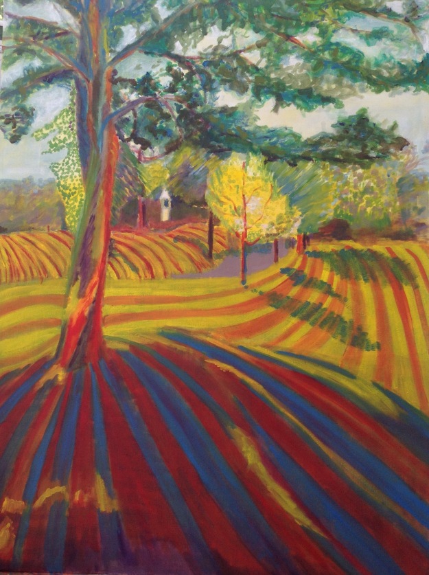
  •  Assignment piece; I explained that I would like to attempt it again as more of a series of works because I feel the straw didn’t work and may have to add more straw on. The next one that I’m painting now has no straw and is much more connected with Hockney after seeing his retrospective at Tate Britain at the weekend. My tutor said another go at it would be a good idea, but only If I have the time. I have reviewed the assignment piece after my discussion with my tutor and changed the background tones so more a lighter hue. Added more grey into the shadow of the tree in the foreground. Still having problems with the shapes of the branches of the tree in the foreground as very flat. In my studies I was able to create branches directing out of the trunk from all directions but have not been able to manage this in the assignment. The colour vibrancies has been toned down and is not so hot. There is now distinctions as a different colour is associated with each depth ( fore/mid/background)  Still not happy with the straw as it flattens the foreground, will think about a solution to this going forward as finding I’m getting stuck on this detail.
  • Sketchbook- shows competent sketches and planning but don’t use it as an exercise log book. Experiment more with paint in the book and explore ideas.
  • Research- explore and reference artist more with why you gravitate towards there work. (Make more connections and links between your work and there’s.) The use of other artist work when resolving a problem is good practice.
  • Blog- discourse a view of moving forward and what you might do to improve.

Suggested viewing; Anselm Kiefer, Peter Doid, Ernst Kirchner, Piet Mondrian (earlier trees), Leon Kossoff.

Have researched and posted biography referenced via the Tate on my Pinterest site.

https://uk.pinterest.com/melinda0822/painting-1-course/

Updated assignment painting. A1 size. Oil paint, sand, straw.


2nd attempt with more of a link to Hockney. And no straw. Oil on canvas A1 size.

Wanted to experiement with the direction of brushwork to aid conceivable shapes, forms and perspective, All technical areas of work. I rubbed off the brush work with a rag drowned in turps. Was. More selective with brushwork and shadows, and then experimented with scraping paint off.  I sat an thought about the colours I would use and the direction of paint for a long time but should have worked on this in my sketchbook first


Assignment 4. Landscapes

Assignment 4 studies.

Review all your paintings and sketches and assess which have been the most engaging and why?

The hard and soft landscape that i painted in oil on an a4 size box canvas was a good study for me as I was able to focus on the dull colours depicted in the view out my back window. The linear study was particular engaging as I feel drawn into the composition and again the colours were an opportunity to change the colour pallet because the light was at full strength that day, and the reflection from the light on the water has an over all effect on the surroundings, for example the grass cliff was much more Naples yellow than burnt sienna. Both these paintings feel more successful than the others because they are smaller and feel more intimate to me due to the views being something I see every day. The comfort is taken by the familiarity of the composition and the feeling that I have been able to depict some resemblance.

This assignment is on about enlarging a study and working partly in location.

Detailed assessment of the finished painting;

The elements that have special appeal to me is contrasting light, the drama of shadows. After reviewing all my landscapes I noticed the same sky pushing down upon the composition. This might be that by the sea we tend to have moist air, low clouds or just a lack of sun at this time of year (April-May). I liked the idea of describing a scene that the viewer felt within, not standing on the hillside looking down but more standing under a tree looking out. This would then take away the damping sky line that I noticed in my previous exercises.

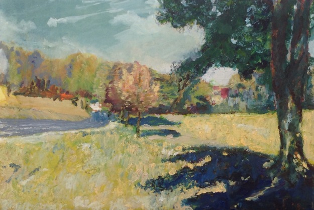
The techniques that i used were to express drama and warmth. When researching the German expressionist, I found a painting by Gustav Klimt (1862-1918) called ‘Avenue at Schloss Kammer’ and this inspired the composition where the tree tops departed from the canvas and no sky line was needed to explain liner perspective. I also looked to Van Gogh and his work completed in the gardens and surrounding area while a patient at Saint Paul De Mausole asylum in Saint Remy. ‘ Undergrowth’ 1889 has blues , greens with black and yellow dancing around together. The composition I was working with needed some brush strokes to show the dense foliage of the sunny park with its lumpy hill side.

First of all I did a drawing at the park of the tonal values and then came home to draw the simplistic shapes of the composition. I had taken some photos of the trees in the park and the overall landscape. The second time I visited the shadows had gone for the day, but I picked some leaves. I wanted to study the colours that I intended to use so I did a quick oil pastel drawing and then stared on a oil painting ; both A2 size. The oil painting had good value of wash where I started with violet foreground and cadmium red mid ground with a primary yellow as the back ground/ tree foliage. These 2 studies were successful as I was able to enlarge the image, trail colour studies and practice the brush strokes size and direction.

Assignment 4 progress

In the images above I worked on an A1 size board covered with canvas and painted in with yellow acrylic and stuck on some straw and mixed some beach sand into the glue. I sat the board up so the glue would run down to suggest the trunk of the tree. Unfortunately the yellow ground all over did me no favours with the violet ground or the blue shadows. I should have painting the ground into sections like I did with the study. The green foliage was where I painted the straw with sap green acrylic and was difficult to do as, not just the top of the straw but where it leaves the surface and leaves a gap between the straw and the canvas, all needed  coverage of paint.  I worked in stages;

  1. light wash to link the shadows together but the light as individual shapes.
  2. validate the values of the shadows , work more tones into the composition.
  3. Work with the lightest areas with white and various yellows such as lemon yellow, primary, cadmium.
  4. I found that the straw was dominating the painting and pulled some away from the board. This left texture and more light was able to balance the interest of contrasting light.
  5. Details of size of brush strokes, diluting of white oil so a wash over the light shapes and layering more paint such as the flesh tint within the tree branches but also repeating that colour in the shadows connected the painting together.


I am pleased so far with the outcome, Its different to the paintings that I engaged with during part 4. Its full of colour and heat. The straw was experimental and I enjoy being able to challenge myself with working with other materials like painting on carpet for assignment 3. This course allows me to push my boundaries with the assignments, where I find the exercises restrict or focus on certain outcomes.

Assignment 3; painting 1

Things to consider first…..

  • consolidate what you’ve learned and plan a portrait.
  • show how your skills in handling paint and interpreting your subject are developing.
  • explore arrangements- look at other artist, visit exhibitions, books or online to consider the –
  • Background, light, Interior, brushwork and use of colour.
  • make notes about works that you find particularly arresting.
  • make studies to work out your composition.
  • think about the painting medium, oil or acrylic?

This assignment was inspired by the work of Samara Scott.

The recent Spring exhibition at the Margate turner contemporary is ‘entangled’ and Scott designed an art work or installed her work on the wall of the service lift. She is interested in site-specific work that can ‘nestle’ in with the surroundings. She explores the fusing of natural and artificial the plasticity and the organic, its a message about contemporary consumers. She uses rich colours an amalgamation of materials that wont last and tend to decompose and develop such as Yogurt. The work is called OLD LAKE and is made up of carpet, yogurt, plaster,food colouring. (no paint)

Entangled_Threads_Making_front_cover.JPG

exhibition leaflet. 2017


Installation view of Samara Scott, Old Lake, 2016 at Entangled: Threads & Making, Turner Contemporary. Courtesy Turner Contemporary. Photo: Stephen White

Photo of lift at the turner contemporary, Margate 2017.

I particularly admired this work and everyone wanted to touch it, take photos so very popular. She has turned a mechanical object- the lift, and reintroduced it to our world as a cosy, tactile space that is organic and therefore restores a human connection with this area. She has not used any paint on the carpet but I was inspired to try this and experiment with mixing paint into fibres of a left over bit of carpet I had at home. This was risky as I have not worked with this medium before other than when I dropped paint onto the carpet at a rented house. I just painted it over as it was very patterned and no one ever noticed other than the carpet had become hard. I also admire the message she is conveying with her work and I think this proves my depth of understanding of the arts is more than just admiring the image but what the image means and represents to the viewer and the artist. Her depiction of a society of consumers where we either pile cream on our faces and stuff food into our mouths is about the blurred line of what society needs and what its needs are.

My assignment was about developing the ideas from the project- ‘People in context’. I was thinking about people ‘out of context’ such as a portrait on carpet, it ‘flips’ the picture from the traditional space of the wall and re-establish itself on the floor with a different purpose. Very similar to the work I saw at the recent Rauschenberg  study visit,where he painted on the sheets of a bed and then presented it as a formal portrait on a wall. The carpet which is a material that is normally found on the floor is re located to the wall. The experiment was to see how the idea developed from using the carpet as a canvas and either using this canvass to refer to its original purpose or to use it as texture background for a painting. Do I bring attention to the material and make it part of the art work or just experiment with the fibres of the carpet? At first I though I would try to recapture the coffee stain that I used in my workbook studies when experimenting with other backgrounds, then I added in wine spillages and footprints. I found this was going in the wrong direction . I tested different ways of painting (aggressive brush work, rubbing into the fibres, laying paint thickly on top of fibres, using a pallet knife) and found that if I used lots of white sprit, I could remove paint in a similar way to a putty rubber with charcoal. I decided to follow on with paint direction and not use other mediums, unlike Scott; I decided this as I intend to send work for assessment in September and I don’t feel confident to send the assessors work with decaying yogurt growing on carpet. I feel this material could have a variety of uses with the next part of the course-Part 4; Landscapes.

The reason I chose this composition is because I feel its the strongest one out of all the work I carried out in part 3. The’ looking up’ direction of the head and the contours of the nose, mouth and the whiteness of the eyes are something that I find interesting with this arrangement. The light on the neck and the wall behind adds drama and tone. The gesturing of the look suggests that the image is not just about a portrait as the face directs their look elsewhere- to the carpet above. The subject is looking up to explain there is something more interesting than my face in this image; the medium that the face is painted on. The painted face on woollen fibres is a message similar to Scott’s. The natural woollen fibres manipulated into carpet alongside manufactured paints. The materials (wool and paint) are both natural but as a consumer society we have developed its purpose into a need (Carpet and easy to use paint). The Binary meaning is that one is soft and the other hardens (the organic and synthetic). I will be bold and relate this statement to the natural occurring emotional function of children becoming adults. I relate this to the human condition as the image is a portrait, a portrait of human existence. An illusion of a portrait in the context of a mat for the floor. The meaning taken from this assignment is an interesting one to develop and the materials used are something I will experiment with again and I am encouraged by the progress of interpreting my subject in part 3.

Assignment 3. self portrait. oil paint on carpet. 2017

Tutors feedback A2

Overall comments.

Don’t send so much. Send 2 paintings including assignment and up to 5 preparatory paintings and drawings.

I think this is a good time to cut back on the amount being sent as the tutor must have a gist of the visual language I’m communicating, what level and what voice I am expressing. I just wonder if there is any point sending hard copies and will enquire at the point of sending if I should just convert to Digital. I changed from OIL paints to Acrylics so the work would be dry for sending to the tutor but, if this isn’t necessary then I will revert back to a medium that I’m more confident with and love.

Feedback on Assignment.

Consistent with the first assignment and at a good level. Competent standard of technical and visual skills for level one.

The drawings are more fluid than the paintings.

The paintings suffer with high key colours and a lack of tonal range, PARTICULARLY MID TONES.

This is a reoccurring comment and one I had from my previous tutor. I have thought thoroughly about this and have had my eyes tested but optometrist do not check tonal perspectives. I think this may be associated with my view upon the world from the Influences of the ‘others’. I think that my tutors are correct about my lack of visualising the mid Tones within compositions or studies but I question; Why do I preferred not to concentrate on the mid tones and why am I attracted to highly contrasting scenes, Artist that use hot contrasting colours (Gogh, Mondrian, Klein) and infatuated by shadows? This is a learning Journey and I must express this learning though my Blog so That my tutors understand why I have a lack of Mid tone. My personality is very ; Black and White and I have a strong identification with the ‘self’, therefore my perception of tone is mater of fact. I need to express this and I do that in my paintings and explain my ‘self’ perception in my Blog.

The need to understand colours is something I need to do with Acrylics as they don’t mix the same as Oils and you can work the oils into a colour on the actual canvas where with acrylics, you have to keep mixing separate colours hourly due to when you change one colour is has an effect on the overall colour range. With Oils I can manage the drying out of the colour but with acrylic is feels like one step at a time (colour by numbers)  instead of a piece of work evolving into something.

My tutor has suggested I try some colour range and tonal control exercises, and to tint when using black and white.

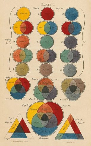
color_diagram_charles_hayter

Enter a caption

Three Primitive Colours Assumed as a Perfect System of Rudimentary Information by Charles Hayter

Sketchbook, learning log/Blog and Critical essays.

Strongest work is in sketchbook, with some competent well- observed drawings. The charcoal can become to heavy and obscure definition and detail. Learning log/blog is comprehensive with displays of research, self appraisal, response to problem solving.

Suggested points for next assignment 3-

Study the work of Watteau, Goya, Degas, Sickert, Doig, C Avery and Jenny Saville and work on Definition, Colour and tonal range, Anatomy, proportion, context, simplify composition, light direction and shadows on the skin and the tonal values.


Reference.

Tutor report dated 13th January 2017.

From <https://plus.google.com/share?url=https://goo.gl/images/fejhLQ>

Assignment 2

Your painting should demonstrate understanding of colour, tone, composition and the development of your technique in your chosen medium.

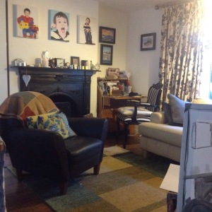
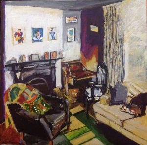
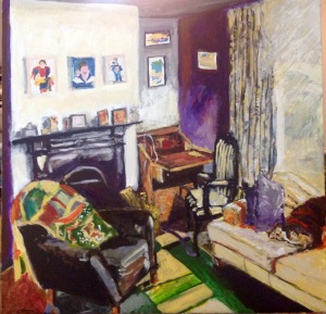
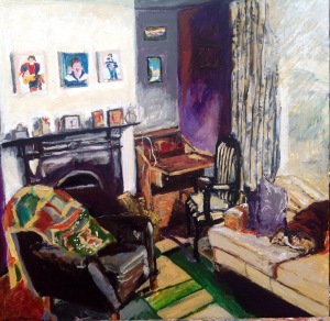
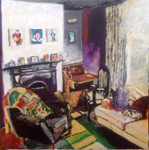
I have gone for the alternative option which was to develop further one of the exercises that I worked on in part 2. I worked on a square canvas as I feel this connected with my composition ; a room within my house.

PAY PARTICULAR ATTENTION TO –

  • viewpoint
  • light source
  • highlights lowlights
  • relationship between background and objects
  • mood

img_2186img_2188

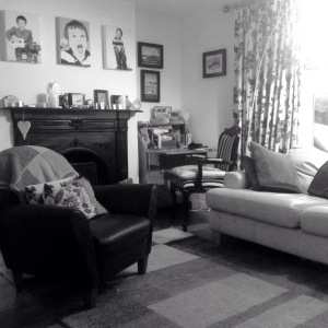
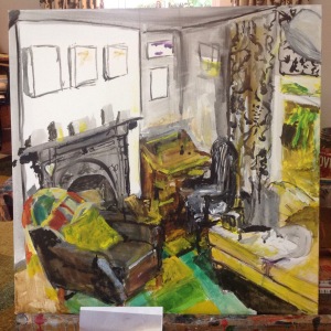
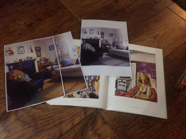
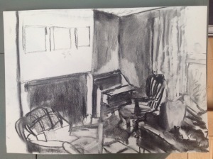
I wanted a composition that was going to show depth and throw some interesting shadows onto forms and show more than just furniture but an essence of a room in my house. I made changes to the photography (to monochrome) , a technique to able me to pay attention to the highlights and lowlights within the room. The tone variation and the light coming in from the window become glow like. This way of analysing the depth of tone helps with reviewing darkest and lightest areas and then I build up the tone between the two.

img_2189img_2190

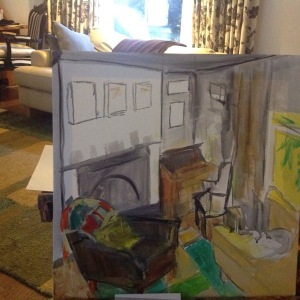
Have blocked in the main shapes and have measured the furniture against each other . All the furniture is crammed but this is helpful when connecting the shapes and forms as they all link or connect in some way. The relationship between objects and background are very closely connected within this busy composition.

I was starting to think about colour at this point and researched some work by David Hockney, Hopper, Richard Diebenkorn and John Bratby.

On The second day of painting I should have put some tape on the floor to mark my Donkeys location as I moved my position and  this effected my viewing point and the shapes did not connect correctly any-more so I had to make changes to the view point- linear perspective , vanishing point. I also felt the light was very intensified on the monotone photo but not as noticeable during a day of painting which was overcast. This is when the photo taken can be helpful in seeing beyond what’s in-front of me at the time.

I had to take stock and reflect upon what I was signifying and what I was spectating at . I wondered; as my style is normal wonky, should I look to Grayson Perry for inspiration as his compositions are lively, modern and colourful , but the brief in the exercises in part two suggest to be as true to actual perspective as possible, so I measured up my painting again and made changes to the placement of furniture and reduced the size of the paintings on the wall and started on colour.

img_2191

img_2200

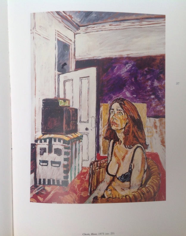
Chests, Hove, 1975 (no 23) by John Bratby

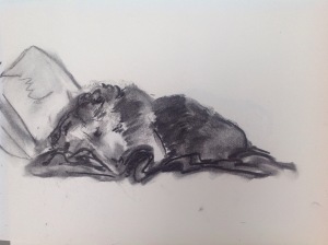
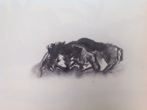
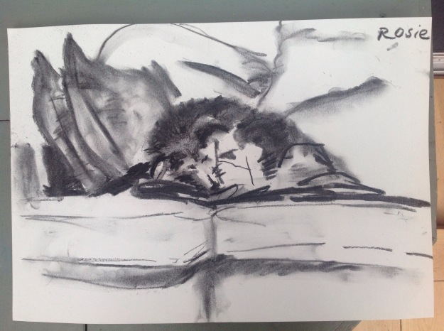
At the moment the desk in the corner is too large and is in-line with the corner of the room but this piece of furniture is set away from the wall so the two lines shouldn’t be inline with each other. The fire place looks as if it is leaning against the wall so the angle is to serve and the pictures are hard to work out if I’m looking at them or up at them and what should their shadow be doing. I turn on a light near the window to help me on another overcast day. Did more studies of the lines and tones within the room again to help me focus and concentrate on the structure of the composition as the colours have become distracting. Having trouble with Rosie the dog so did some quick charcoal drawings while sitting on the floor.

img_2193img_2201img_2202img_2203

Very much like the violet wall; taken inspiration from John Bratby -Chests , Hove, no 23. John Bratby Portraits, National portrait galley publication. London 1991

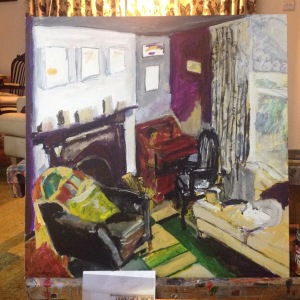
The split complementary colours of red violet, green and yellow are  cool but directing towards warmth at the same time. The light coming in the window is now more ghostly  and less of a glow. The violet wall is starting to look like it is on fire so need to tone that down as far to prominent.

img_2195img_2196

I was able to put some glow back into the window although it would have been better it it was a more radiant glow but instead it is a muted tone glow. Very pleased with the shadows the arm chair gives on the rug and up onto the desk, I feel this is reminiscent of HOPPER. Love the rug and the colours and this association of Richard Diebenkorn reminds me of my youth ,as I studied his work at art school. The blanket, on the leather chair with the Broken arm reinforces the Diebenkorn rug and was tempted to paint this in more but I have come to a stage where I am close to a finish and need to be careful not to lose the essence. This is a cramped basement because we have adopted the lounge upstairs into another bedroom so foreign students can stay in which gives us A little more income. This room is very cosy but is over crowded now.

Rosie the dog is being a problem where she knows when I am drawing or painter her so turns her back to me. I have drawn some studies of her to help when painting her in but may have to take her out of the painting or paint the blanket grey so she is more defined. I wanted her in as she is a big part of the room and she gives the room life, it becomes more than a room full of furniture but a room where Rosie lays.


img_2199img_2205

  • Need to get this posted to my tutor now but- I don’t like the cushion on the leather chair as it’s far to white and resembles snow drops. Will need to think about this area again. Want to take out the picture on the top right corner. Other than that I am happy for now. Will await tutors comments.