Please see the link for the notes on research on the evolving landscape from the 18th century till present day.
Part 4 Looking out research point.
Leave a reply
Please see the link for the notes on research on the evolving landscape from the 18th century till present day.
Things to consider first…..
This assignment was inspired by the work of Samara Scott.
The recent Spring exhibition at the Margate turner contemporary is ‘entangled’ and Scott designed an art work or installed her work on the wall of the service lift. She is interested in site-specific work that can ‘nestle’ in with the surroundings. She explores the fusing of natural and artificial the plasticity and the organic, its a message about contemporary consumers. She uses rich colours an amalgamation of materials that wont last and tend to decompose and develop such as Yogurt. The work is called OLD LAKE and is made up of carpet, yogurt, plaster,food colouring. (no paint)

exhibition leaflet. 2017

Photo of lift at the turner contemporary, Margate 2017.
I particularly admired this work and everyone wanted to touch it, take photos so very popular. She has turned a mechanical object- the lift, and reintroduced it to our world as a cosy, tactile space that is organic and therefore restores a human connection with this area. She has not used any paint on the carpet but I was inspired to try this and experiment with mixing paint into fibres of a left over bit of carpet I had at home. This was risky as I have not worked with this medium before other than when I dropped paint onto the carpet at a rented house. I just painted it over as it was very patterned and no one ever noticed other than the carpet had become hard. I also admire the message she is conveying with her work and I think this proves my depth of understanding of the arts is more than just admiring the image but what the image means and represents to the viewer and the artist. Her depiction of a society of consumers where we either pile cream on our faces and stuff food into our mouths is about the blurred line of what society needs and what its needs are.
My assignment was about developing the ideas from the project- ‘People in context’. I was thinking about people ‘out of context’ such as a portrait on carpet, it ‘flips’ the picture from the traditional space of the wall and re-establish itself on the floor with a different purpose. Very similar to the work I saw at the recent Rauschenberg study visit,where he painted on the sheets of a bed and then presented it as a formal portrait on a wall. The carpet which is a material that is normally found on the floor is re located to the wall. The experiment was to see how the idea developed from using the carpet as a canvas and either using this canvass to refer to its original purpose or to use it as texture background for a painting. Do I bring attention to the material and make it part of the art work or just experiment with the fibres of the carpet? At first I though I would try to recapture the coffee stain that I used in my workbook studies when experimenting with other backgrounds, then I added in wine spillages and footprints. I found this was going in the wrong direction . I tested different ways of painting (aggressive brush work, rubbing into the fibres, laying paint thickly on top of fibres, using a pallet knife) and found that if I used lots of white sprit, I could remove paint in a similar way to a putty rubber with charcoal. I decided to follow on with paint direction and not use other mediums, unlike Scott; I decided this as I intend to send work for assessment in September and I don’t feel confident to send the assessors work with decaying yogurt growing on carpet. I feel this material could have a variety of uses with the next part of the course-Part 4; Landscapes.
The reason I chose this composition is because I feel its the strongest one out of all the work I carried out in part 3. The’ looking up’ direction of the head and the contours of the nose, mouth and the whiteness of the eyes are something that I find interesting with this arrangement. The light on the neck and the wall behind adds drama and tone. The gesturing of the look suggests that the image is not just about a portrait as the face directs their look elsewhere- to the carpet above. The subject is looking up to explain there is something more interesting than my face in this image; the medium that the face is painted on. The painted face on woollen fibres is a message similar to Scott’s. The natural woollen fibres manipulated into carpet alongside manufactured paints. The materials (wool and paint) are both natural but as a consumer society we have developed its purpose into a need (Carpet and easy to use paint). The Binary meaning is that one is soft and the other hardens (the organic and synthetic). I will be bold and relate this statement to the natural occurring emotional function of children becoming adults. I relate this to the human condition as the image is a portrait, a portrait of human existence. An illusion of a portrait in the context of a mat for the floor. The meaning taken from this assignment is an interesting one to develop and the materials used are something I will experiment with again and I am encouraged by the progress of interpreting my subject in part 3.

")

")
")

Assignment 3. self portrait. oil paint on carpet. 2017
ALL IMAGES SHOWN ARE PUBLIC DOMAIN.
An exercise within the project; People in context- part 3.
People in context is about depicting human figure/s with in a particular environment which enforces the figure to become part of a wider subject. When you place a figure in an interior you are looking at a complex form within a more structured area- organic form within the confinement of walls and objects. The meaning that can be taken from the positioning of the figure is important for example the figure in the corner can be though as being a mysterious figure lurking in a darkened corner. The figure positioned close up, dominating the image can be thought as powerful or important. The positioning of other figures can then tell a story within an image. The drawings by David Haines create a strange narrative where boys are forced to smell a range of sneakers. The images convey a thug culture, the harsh reality for young urban men but the medium the artist has used is the soft scale tonality of pencil. Here the objects such as the Bucket of KFC is given just as much importance as the figures as they are directing their gaze at the ‘fast food.’
New Balance Sneaker vs KFC Bucket (2007/8) Pencil on paper 140×216.5cm <http://www.davidhaines.org/work04.html>
The exercise was about painting a figure in a room and the course reader suggested not to complicate things as simplicity allows for the negative shapes around the figure to incorporate the form within a balanced composition. One approach the reader suggested is to place a celebrity within a familiar room, I was intrigued by this as I felt the lack of pressure to paint Graham Norton accurately developed the portrait to be a success.
Think about-
One of my all time favourite paintings is ENNUI (Boredom) by Sickert.

Walter Richard Sickert 1860–1942 Ennui c.1914 Oil paint on canvas 1524 x 1124 mm http://www.tate.org.uk/art/research-publications/camden-town-group/walter-richard-sickert-ennui-r1133434>
‘The physical proximity of the two figures supposes an intimate connection between them such as marriage, but their complete disassociation and lack of engagement with one another creates an atmosphere of isolation, indifference and loneliness’ Tate Cited 3.3.2017
I love the warm tones and how the figures are positioned, such as the man sitting and the women standing, slumped over the chest of draws looking into something. The roundness of the table which takes up a third of the painting is a barrier for the viewer from the figures in the room, your eye either has to jump over the table or follow the curve of the table to understand the depth and perspective of the composition. The tension between the two figures, is what I remember the most about this painting, not the objects in the painting. When painting figures they mean more to me than just 3D forms that are organic, they are human and have emotions, feelings, character. To depict tension within the confined space of a room is challenging but Sickert achieves it brilliantly in Ennui.
I tried to set up this pose in my lounge, but the chest of draws were to low and I felt the room lacked light. The figures were going to be my Husband with our daughter, they have a fantastic relationship but are from different times, like all generations. I wanted to depict this relationship, a coming of age daughter and a maturating husband/dad. When I thought about depicting these qualities I looked to Hockney and how he used objects to aid his representation of figures characters such as the white cat (Percy) in Mr and Mrs Clark with Percy. 1970-1.
My painting is from a photo of my Husband and myself in our bay window with a chair that is used as a computer/ desk chair. The chair has significance because we brought a pair of chairs with the money given to us by the Labour government when Gordon Brown paid out a lump sum to couples with new born babies back in 2005. As a nation I think we are still paying for that excessive lump sum, and as a reminder of fortunate events, my husband and I call these chairs the Gordon Browns. I added in the patterned rug and then painted over it, as the design on the rug caused the perspective to become confusing, if the rug had a tile pattern then that would have worked. The light source at the centre causes problems , just so for Hockney as he mentions he had problems with tonal clarification due to the light coming in from behind the figures. I took a long time mixing the correct colour paints. I used the colour photo to aid with the pallet choices. The walls are painted white in our house but the photo is very muddy, grainy due to the light behind the curtains. The paper light shade is noticeable in the left hand corner and is on so gives a warm tinge to the interior. I feel this image is to simplistic but the best solution for a complex exercise.
The progress of learning during this exercise was

Photo March 2017

Oil painting . Gordon Browns. 2017
Reference.
Tate cited on the 3.3.2017
David Haines web site http://www.davidhaines.org/work04.html>
Google search for Cindy Sherman and Barbara Kruger
Find 2-3 pictures from different periods of people in context, interiors.
Image; http://www.tate-images.com/results.asp?image=T00118>
Lytton Strachey
Artist: Henry Lamb 1883-1960
Date: 1914
Classification: painting
Medium: Oil paint on canvas
Dimensions: support: 2445 x 1784 mm
Presented by the Trustees of the Chantrey Bequest 1957
This Henry lamb oil painting appeals to me because of the elongation of the figure and the over large window.
The translucent trees outside are interesting as they are solid forms but are painted transparently. When I look at this painting I feel like the man in the painting, glum, tired, my shoulders slump and I find myself going into deep thought.
The colours are warm but dull and reflect the mans mood who once said that he was unable to lift a match before breakfast. The view outside the window gives depth to the composition and the couple walking add another narrative to the image. The hat and umbrella indicate that Lytton (wearing slippers) is a guest or is being visited by the viewer/the artist, it adds a mystery to the narrative.
The artist intentions were to depict Lyttons Stracheys feelings and character not just a likeness. He has done this using the soft tones of a warm colour pallet, kept depth to the painting with the use of landscape and trees that are represented in a transdisscent way suggesting they are neither here nor there; like the character that is Lytton.
The technical and creative solutions that were used to represent mood and character in the form of colour harmonies with a warm colour pallet, diluting the paint so to create a translucent coverage and elongating the body and the window to inform the viewer that the character being painted was elegant, lethargic, and longing for another place. The distant look in his eyes suggests a connotation that the sitter is thoughtful, an intellect and is not interacting with the artist. The subject is more about a mood, atmosphere and character than representing a likeness in front of an oversized window.
When researching Lytton (1880-1932.51) I found that he was the 5th child from a family of 11 and that his father, a Lieutenant later became a Sir and His Mother was a leader of the women’s suffrage movement. Born in Clapham, London and went to Cambridge University and Later was one of the older but founders of the Bloomsbury group along with Virginia Wolf and Rodger Fry. He published ‘Eminent Victorians’ in 1918 which is a Biography about 4 Victorians but written in a way that was psychological, sympathetic, witty and irreverent. His Brother was James Strachey whom translated Sigmund Freud’s essays into English. He had an interesting 3 way relationship with Dora Carrington who married Ralph Partridge, they all lived together at Ham spray house in Marlborough, Wiltshire. Lytton died of stomach cancer and Dora committed suicide 2 months after his death. Partridge married his lover ( Francis, member of the Bloomsbury group . Diaries) and they had a baby boy which they called Lytton.
Henry Lamb 1883-1960, Australian born British artist founder of the Camden Town Group. Studied medicine in Manchester and was a medical officer in the 1st world war and a war memorial artist in the 2nd. He graduated from Chelsea school of art and design in 1907. In 1940 was invited as an associate of the royal academy and later a trustee of the national portrait gallery and the Tate. Breton Boy (1910) was sold in 2006 for £60,000.
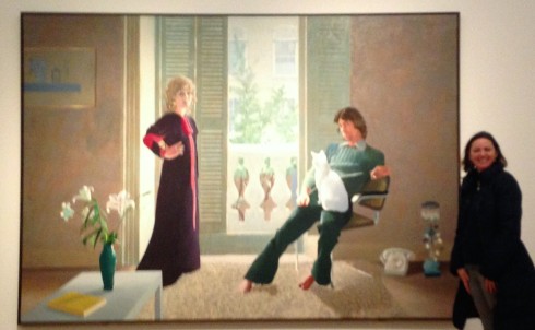
Mr and Mrs Clark and Percy 1971
David Hockney born 1937
Medium Acrylic paint on canvas
Dimensions Support: 2134 x 3048 mm frame: 2170 x 3084 x 58 mm
Tate http://www.tate.org.uk/art/artworks/hockney-mr-and-mrs-clark-and-percy-t01269>
I have seen this painting which is life size at the Tate Britain and it is in a room where each wall has a life size Hockney painting hung. This painting appeals to me because Hockney has painted an atmosphere and the room with the rug and rather peculiar objects such as the telephone and lamp on the floor and the bland colours signify a realistic moment and when I saw this in person I felt like I could have been in the painted room with Mr and Mrs Clark.
Hockney has referred to -‘…the famous portrait of a married couple, The Arnolfini Marriage 1434 (National Gallery, London) by Flemish renaissance painter Jan van Eyck (approximately 1395–1441), in which a small dog at the couple’s feet represents fidelity.’ http://www.tate.org.uk/art/artworks/hockney-mr-and-mrs-clark-and-percy-t01269> When painting his recently married Friends ,he wanted to paint a true representation of his friends but also the atmosphere in the room. By painting the couple in their bedroom with the open French doors he was able to depict an open relationship that didn’t last.
The Technical problems were; the light from the door and the figures in front of this light as it was harder to determine the tonal range , apparently he painted Ossie’s face 12 times due to the size of the figures. He also chose to turn the eyes/face of the couple out of the canvas where previously; one person starring out while the other watches the other starring out creating a circle of looking. The creative solution to help Hockney naturally represent the couple was that he created the same bedroom light in his studio. He also drew the couple many times and took photographs. The cat and the lilies symbolize a meaning that aid Hockney to tell a story about the couple. The cat is a sign of liberty and often cats are not loyal pets, the Lilies symbolise purity and femininity. The subject has been simplified within this composition which causes a more powerful reason to take meaning from the image. The sensation of looking, from a central location and being welcomed into the realm of Mr and Mrs Clark bedroom is rather peculiar and allows the viewer to stop and think about what is going on in this arrangement of a couple within a minimalistic room with some object that are missing a table. The couple are together in the room but not together in a marriage
